Welcome to Gems & Geodes

An information hotspot for those seeking handy tips and sources for inspiration.

Friday, May 14, 2010

Decorating with One Colour + White

Up until now I have been stressing that you can create cohesion in your space by grouping or pairing the same, similar or complementary colours.  I want to delve into the world of decorating with one colour + white.  I know what you're thinking "she's gone off the deep end", but I assure you that I haven't.  With the right injection of colour, shade and depth, using white as the anchor is possible and will look amazing!


The #1 Rule: The number one rule when decorating your space in one colour is to never use the same shade throughout.  Colours (as I have mentioned in past) come in a plethora of shades, so the worst thing you could do is to pick a colour say, pale blue and use that same shade throughout your space without changing the depth of the colour.  I know you're thinking to yourself again that I've lost it, but trust me, work with me on this one, and you'll see how easily you can decorate a space in no time using only one colour + white.


Why White?: The reason white is used as the anchor is due to its brilliance.  White is a balancing colour which can easily be paired with any colour on the colour wheel and look fantastic.  White creates cohesion and is calming to the eye it's appearance is thought of as clean and therefore will create balance between the colour you select and the room itself.  Think of white as a non-colour, it's there, but it's not.  White acts as a base and a neutral, so feel free to use it liberally or sparingly in your space, but be sure to use it!


What Colour Do I Choose?: That depends on you and the space, different colours can illicit different moods and have a certain feeling associated with them, such as:
BLUE - represents peace, tranquility, calm, stability, harmony, confidence, cleanliness and order.
BLACK - represents power, sexuality, sophistication, formality, elegance, wealth and depth.
GREEN - represents nature, environment, health, good-luck, renewal, youth and generosity.
ORANGE - represents warmth, enthusiasm, balance, vibrance, flamboyancy and demands attention.
PURPLE - represents royalty, spirituality, nobility, ceremony, mystery, transformation and wisdom.
RED - represents strength, warmth, luck, love, desire, speed and vibrance.
WHITE - represents reverence, purity, simplicity, cleanliness, peace, humility and precision.
YELLOW - represents joy, happiness, optimism, idealism, imagination, hope and spirituality.
The colour you decide to choose for the space you have in mind should be reflective of the message you want to convey.  Do you want the space to be restful or vibrant?  Cool or warm?  Keep these thoughts in mind when selecting the colour you would like to use as the colour you select does have this kind of impact.


How Can I Work the Colour Into The Room?: The easiest way to achieve balance with the colour you select (+ white) is to use the colour in varying shades.  If you decide to go with the colour green for example use shades of green from apple green to olive.  If you choose blue use shades from royal to aqua.  Here are some examples of the varying colours you can use:


The trick is to inject colour into the room using the similar tones and levels of colour, you don't want to use all brights and darks because that will be too stark a contrast.  Although, with that being said there is nothing wrong with injecting one or two smaller objects into your space that are outside the colour harmony.  As you will see with the colour selections in green, blue, yellow and red above, the levels and tones of the colour can vary drastically from one spectrum to another.  
If you decide to go with the colour pink for example, there is nothing wrong with using bubblegum pink to fuchsia.  If you have a pillow in highlighter pink feel free to use it in the space.  This is the variance I was talking about, as long as you don't use bubblegum pink and highlighter pink throughout the space you'll be just fine.  It's all about balance.

TIP: When thinking about colour, take a trip to the local hardware store and into the paint section.  Select a colour chip that strikes your eye.  What you'll find is that the paint chip has provided you with the colour you like in varying tones and shades.  The same principle applies when selecting objects for your space.  Think in terms of paint chips.

So now that you have the basics in mind here are some examples of one colour + white rooms:


As you can see from the examples above the colour variations in the spaces differ, some are softer hues others are bold.  The choice is yours and believe me, this is one of the easiest interior decor solutions for your space, just keep the tips I gave you above in mind when out searching for that next colour piece to add to your one colour + white room.

Happy Shopping!!

Wednesday, May 12, 2010

Colour Coordination in your Home Part 2 - The Neutral Backdrop, Con't

Part 1 of this 2 part series talked about the major pieces in the room I was providing examples on - the living/family room.  I discussed how you can inject colour into the space without having to go crazy on your walls.  In part 2, I am going to discuss how to finish off your space with decorative objects and artwork.


In Part 1, I talked about colour being used in pieces such as the sofa, coffee table, bookcase and entertainment/TV unit.  All while leaving the walls as a neutral jumping off point for the insertion of these pieces into the space.  I would like to now touch upon the use of decorative objects and artwork to help finish off the space and bring it to life.


VASES/BOWLS
Vases and bowls come in a multitude of shapes, sizes, styles and colours, and happen to be one of the easiest ways you can inject some colour and texture into your space.  You could easily take a glass or crystal vase and pump up the room with a wonderful bouquet of flowers or your could create a collection of pieces that could easily draw the eye.  Here are some examples of how you could create an arrangement of vases and bowls in different shapes, sizes and colours:


The key when creating a collection for display is to stick with one colour or colour combination, it makes the collection look cohesive and well thought out.  Another tip when starting a collection for display is to look for pieces of varying heights; the look is aesthetically pleasing.  Get creative with your collection and believe me, this is one of the fastest and easiest ways to create impact in your room's decor.


CANDLES
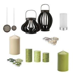
A quick and simple way to create ambiance in a room is with lighting, and no better lighting that that from a candle.  This small flickering light is most appealing and creates a flattering glow on everyone and everything in the room.  Hey, now who said that romance is dead!  You can get creative with your candle situation in your room, just be sure never to leave them unattended or in a location that could potentially run the risk of being a fire hazard, i.e. near your flowing draperies.  You can create colour with candles in two ways, either with the candles themselves or with the holders/candelabra's.  In order to create cohesion using candles stick to one colour scheme, this doesn't mean that all your candles have to be one colour and the holders another, feel free to mix and match, just be sure that you stay within the same scheme otherwise you won't achieve the look you're after.  Here are some ideas:
Black-Cream-White-Green                                                                    Silver-Beige-Brown
Red-Orange


ORBS + DECORATIVE OBJECTS
Orbs are a great way of adding some texture to an otherwise plain tray, dish or bowl.  All you have to do is select a grouping of them, many are already packaged together in a collection for you so all you have to do is find an interesting vessel and place them.  They could be housed on a bookshelf, your coffee table or sideboard.  The possibilities are endless!
Decorative objects are easy examples of where you can create a theme or whimsy in your space.  Don't overload your surroundings with too many as this can look cluttered, but there is nothing wrong with adding a globe, clock or bookends to your space to make a personal statement without getting crazy.  Stick with items in related colours but there is nothing to say that all of the objects have to be the same size.  Get creative with the decorative objects you add to your space.


ARTWORK
Artwork is very personal and should reflect your personal tastes and style, but these pieces should also tie the room together or at least be a part of it.  You want to make sure when selecting artwork for your space that the dimensions work and the type(s) of prints/canvas fit with the theme or look you're trying to convey.  Take your time, one of the biggest mistakes people make is that they select art for the sake of selecting art.  You should really love the piece before you make the commitment to purchase it, whether it's an original, something you picked up at a yard sale or something you've created on your own.  This piece that you are inserting into your space should say something about you and sing in the room - but not like a banshee!
For some tips on how to hang artwork check out my blog post on this topic.


BOOKS
Books are a great way to add some personality to your bookcase or shelves, it's all in how you arrange them.  Cramming as many books onto your bookcase doesn't look very appealing and feels a bit chaotic.  Start by removing all the books from their current location and sort them by: 1. hardcover, 2. softcover (paperback), 3. oversized and 4. magazines/paper.  Next is to sort them by colour; if you don't mind removing the covers from the hard-backed books you can easily sort the hardcovers this way.  The spines of the softcovers should be grouped together by colour or colour combinations and the oversized books should be sorted the same.  Next start removing books that look like they've seen some better days and all magazines/paper should be put into a magazine file or removed all together.


Instead of putting the books upright in rows on your shelves, why not try angling them or laying some down.  Create a more relaxed look to the way you re-stack the books on your bookcase/shelf.  Throw in some decorative objects as well to create a decorative look to the placement of your books.  Just remember to keep the ones you use most often easily accessible and you'll be all set.  Books can also be put on display on your coffee or side tables, stacked on the floor or on a nearby empty wooden chair.  The choice is yours, so get creative with the arrangement of books in your space.


Here is a photo of the bookcase I have in the front/living combined dining rooms.  The bookcase acts as a room divider for the spaces so both sides of the open-concept bookcase needed to look appealing from the front/living and dining spaces:
You will see in the image above that the books have been organized by colour and size.  The look is very relaxed and there are many decorative objects both in and on the bookcase.  Remember not to overwhelm with too many decorative objects otherwise the look will be cluttered.


These tips that I have provided to you are a great start for making a good impact on the space that you decide to decorate.  I used the family/living room as the example in this situation so as to help narrow down the amount of information about how to decorate spaces.  You can easily apply these tips when decorating other spaces in your home as well.  Based on the examples of objects and furniture items that I presented I have pulled together (as best I can, given the limited computer software that I have) the family/living room concept based on the neutral backdrop:
So remember when you're out there shopping for the next great accessory or large impact piece for your space make sure that you take the time to think about the colours in the room to create balance, the size of the pieces and the overall look you want to achieve.


Quick Tip: White grounds the space, so be sure to inject white into your groupings or furniture.


Happy Shopping!


Courtesy of:
Pier 1
Structube
Anthropologie
IKEA
Art.com

Monday, May 10, 2010

Don't be a Fashion Victim

Okay ladies, let's be honest here for a minute, I've seen you do it, I know it's happened, you've been victim to a crime against fashion - either committing the crime or witnessing one.  Our judgment get's the better of us, it sometimes happens.  And then there are those of us who don't even know that a crime has been committed...well I'm here to help stop the inciting of those fashion violations!


Here are some "fashions" (I use that word loosely) that should be avoided wherever possible:

  1. Socks with Sandals - one of my biggest pet-peeves!: No excuses here ladies, Birkenstock's and sandals should only be left to those living in compounds.  If this does not apply to you, then refrain from this fashion violation.  "But my feet are cold", then please I beg of you, wear covered shoes.  But whatever you do, do not put those sock covered feet into a pair of sandals - Birkenstock's or otherwise.

  2. Cropped Pants and Short Boots:  I happened to witness this crime against fashion while I was shopping for gardening goodies at Costco.  A shorter lady was sporting a pair of these bad boys and all I could think of was "Why?!".  She was already short to begin with and the cropped pants - which ended up looking like flood pants on her - paired with short zip-up boots (not to be confused with booties) made her look stocky and disproportionate.  So please gals, if you want to do the cropped pant/boot look the rule of thumb is: when you are standing up and you can see leg space between the cropped pant and boot then your boots are too short.  The boot should be covered by the pant when standing/walking.  Otherwise stick to sandals (without socks!) or pumps.

  3. Exposing Panties: Yes ladies, I have seen this on girls over 30 - not that I recommend this look for anyone!  Exposing your panties/crack is not hot, it looks trashy and makes you look cheap.  Take my word for it, get pants that cover the rear and don't expose your unmentionables, you will thank me for it later!  I understand that sometimes it is unavoidable, but the gals that I caught a glimpse of were using this as a fashion statement, and that statement is not one that should be made.

  4. Clothes that are Waaaay Too Big: Why do we do this to ourselves?!?  Why is it that we think that by purchasing over-sized clothing is going to magically cover up parts of us that we don't want the public to see?  Well gals, I'm sorry to say, but this does nothing but emphasize the figure.  Yes, it's true, this "look" actually makes you look larger!  So please, please, please stop this crime against fashion, get clothes that fit and show off your curves!  Believe me, you and the public will be happier for it!!

  5. Clothes that are Waaaay Too Tight:  The flip-side of #4 above is another fashion no-no that a lot of women like to commit.  Clothes that are too tight provide the exact same emphasis as clothes that are too big - they draw the eye to places that many of us want to cover up, or in this instance, should cover up.  The difference between clothes that are too tight and clothes that are too big comes down to confidence and self-esteem.  The ladies who are sporting the skin tight threads tend to exhibit an air of confidence.  The only problem is, the rest of the world is looking at them like they should be street-walkers, and can't see the confident women that lay within.  So ladies please, do yourself a favour and get yourself some clothes one, two or sometimes even three sizes larger than what you're currently sporting and let's show off the confidence in how you present yourself, believe me, it will make the world of difference.

  6. Plastic/PVC Clothing:  Enough said.

  7. Wearing every Colour in the Rainbow:  I cannot believe that I have still seen women victim to the "I must look like the Crayola crayon box".  Ladies whatever you do, please do not mix all the colours you have in your closet and go out in public looking like one of Charles Manson's acid trips.  Wearing colour is great, wearing all colours at once was only good when you were in pre-school.  Tone it down and stick to colours that are coordinated and hues that don't clash.

  8. Pajama's In Public:  Really?!?  Why would anyone want to even consider this.  Pajama's are meant for the home, snuggled up with your loved ones in front of the fire on a chilly wintery morning - NOT for going to the mall or local grocery store.  I know what you're saying right now "but I was only going out for a pint of ice cream and a sappy love story to rent...", well ladies, that is not an excuse.  Throw on a pair of jeans, but please, please, please leave the jammies at home.

  9. Tattered Sweatpants/Clothing:  Never, ever, do this.  Don't subject yourself to this trap of thinking that ratty, tattered clothing is comfortable and worth subjecting the rest of the world to seeing you in.  Listen to me, you are not doing yourself any favours!  Tattered threads should either be torn apart completely and used to wash your car with or something to kick around the house in when you're doing the chores - but believe me ladies, your man will thank you if you don't decide to do the chores in these duds or ever sport them in public again.  So say it with me "I am going to cut these threads and never use them again!" - say it one more time, and then do the honour of cutting them into a million pieces!

  10. Hooker Heels:  Trust me you've seen them, they're the latest rage, sadly.  There is a reason I nicknamed them hooker heels and unless you are one of the lovely ladies of the night, do not wear these in public.  The privacy of your bedroom is fine, heck your man will probably get a kick out of them (no pun intended), but not in public.
So those are just a few of the fashion violations that I have witnessed over the past week.  Can you believe it, that's all in one week and that's from what I could remember!  Ladies, you are not doing yourselves any favours by committing these crimes and if you or a friend you know has been subject to one or more of these infractions, I say you issue her a citation and take her to the shops as quickly as you can!

Thanks for allowing me to be frank and candid with you today!!

Friday, May 7, 2010

DIY Brass Tiered Side Table Project

As I was out and about over the weekend I saw that one of my eager neighbours put out some items for collection at their curb.  I couldn't help but take notice of this hideous brass tiered side table that was sitting there alone at the curb in the rain - kinda reminded me of that IKEA commercial some years back.  I hemmed and hawed over whether I should claim this sad looking side table on the side-of-the-road, so I did.  What drew me to this curb-side find were the lines.  I figured that with some TLC this piece could have a new lease on life, here is what I did:


What I Used
220 grit Sandpaper
White flat finish Spray Paint - 2 cans (this baby needed more than 2 coats!)
Dry Cloth
Fabric Swatch
Clear drying glue
2 Baskets
And lots of elbow grease


Here is a before shot of the side table:
The brass shine finish needed to be sanded off before the paint would adhere, this is where the 220 grit sandpaper came in handy.  You don't want to scratch the brass because the gouges will show up once the paint dries so be sure not to go any lower than 220 grit.  After some elbow grease I wiped down the table with a dry cloth - a wet cloth will leave moisture on the brass and could cause rust to form, so be sure to use a dry cloth to wipe off the dust.


I could have used a primer coat of spray paint and you could do this in lieu of three coats of the white flat finish which will cut down on the time you spend, but I decided to make my life difficult and sprayed until my heart was content.  And after two full coats and one for touch-ups I was happy with the outcome.


The side table came with a glass top and I wanted to add a bit of something to the underside of the glass for a touch of intrigue.  The fabric swatch I had was cut to size, pressed and glued to the underside of the glass - good side facing up through the glass. Small incisions were made to allow the suction-cups (that came with the side table) to adhere to the glass.  This is so that the glass doesn't slip off when being used or transported. 


Here are a couple of after shots of the side table:

I really like how the black pops off of the white in re-finished side table, baskets and fabric.  This side-of-the-road cast-off now has a new lease on life with a fresh coat of paint, some TLC and accessories, and is now a proud member of my home happily placed in my guest room as a bedside table.

Thursday, May 6, 2010

Bags O' Plenty

Q: Should you change your bag to suit the seasons?
A: Yes, definitely!


Bags are a great way to add some personality and colour throughout the seasons so why would you stick to basic black or brown all year round?  Consider adding some fun colours in the warmer seasons, and if you're fortunate to live in a warm climate you can use them all year round!  Darker colours should be reserved for the Fall/Winter.  


Think about it this way: when the temperature starts to heat-up, turn up the colour; and when it starts to drop, tone it down.  Lighter shades of pastel and grey's (i.e. dove grey) are great for the Spring.  Bright colours and white/cream are reserved for the Summer.  Tans, taupes and grey's are good in the Fall, and black or brown is perfect for the Winter.  Sure you can wear your black bag all year round, but with the multitude of choice out there why would you?!?


Also think about detail on your bag, you don't want to get too heavy on the hardware, but a little detail here and there never hurts.  The details should be toned down in the cooler months (if you live in a climate like I do), but you can get really funky when the mercury starts rising.


Below are some I selected to get you inspired for your next purchase...and yes, there is even a black and brown one thrown in there.  I've included some great bags with details and others that are quite simple.  After all, a lady's handbag is a very personal thing, so it's okay to think about yourself when selecting a bag that you want to carry.


Since we are in the throws of Spring here in Canada and with Summer right around the corner, the bags I selected are geared toward these seasons.


Happy Shopping!!

Courtesy of:

Wednesday, May 5, 2010

Arranging Artwork on your Walls

The task of hanging artwork on the walls can be a challenging one for many.  Some make the mistake of hanging the art too high, others too low; some choose to hang a small print on a large wall or a print that isn't proportionate to the furnishings.  Well not to worry, I have some tips and tricks to help with the look and placement of art on your walls.


How High Do I Go?
Most people make the mistake of hanging artwork too high on the wall.  I have personally seen the smallest of art pieces hung as close to the ceiling as possible, this is a big mistake in many ways: 1. the size of the art piece was way too small for the large expanse of wall and 2. it was hung way too high.  If you have to crane your neck to see the artwork then you've gone too far.  


Typically the center of the artwork should be hung no higher than eye level.  If you are hanging a group of art pieces, the center of the grouping should also be no higher than eye level.  If you are tall (like me) then lower the artwork slightly to accommodate the average sized person, like I mentioned before, you don't want people to crane their necks to see the artwork, but don't go too low otherwise you won't be able to enjoy the piece yourself.  Keep in mind that this is just a general guideline for hanging art pieces and that it doesn't apply to all situations, depending on the space and size of the artwork/grouping.


Proportions are Important
There are a number of factors when it comes to selecting artwork or photography for the walls such as:
  • Size of the artwork/photograph/print
  • Size of the wall
  • Size of the furnishings in the space
You want to select a piece that won't under-perform and you don't want one that is going to over-power, trust me I know you're thinking at this point that this is impossible, but I promise you that there is a happy medium.  Let's start with the size of the wall, you want to consider what the wall/room will be used for.  Is it a combination family/dining room?  Open concept space? or a small nook?  It is important to first identify the room and the role the wall plays in the space so that you can identify the appropriate size of artwork or number of prints to select.  You want to be sure to relate the size of the artwork to the size of the space.  Use smaller prints in smaller spaces i.e. narrow walls or nooks, and larger prints for big wall spaces.

The next step is to determine the relation of the size of print to the furniture pieces in the room.  If you are going to be placing a print over the sofa then you want to select one that is in good proportion to the size of the sofa.  You don't want to hang a small print on the wall behind your sofa, nor do you want one that overhangs.  A general tip is to hang a print which is about 75% of the width of your furniture.

How Many Should I Hang?
This really depends on the look that you want to achieve.  A grid grouping is always a nice transition from one larger print, it provides the illusion of one grand art-piece but allows you to use different images.  One trick to keep the look consistent is to use the same frames and same colour matting.  If you want to go for a gallery look, try hanging a row of 5 framed prints on the wall or over your headboard.  My preference is to hang prints in odd numbers because the effect is more appealing to the eye; groups of 1, 3, 5, or 7 are always a nice touch (this is if you're not going for a grid grouping as these should always be in even numbers).  A good tip is to arrange the artwork on the floor or a table to see what works for you, this way you're not left banging a bunch of holes in your walls in an attempt to find an appealing look!


No One Says you Have to Hang it on the Wall
Not every piece of artwork needs to be hung on the wall, why not try leaning some up on a shelf or place them in your hallway on a credenza or like I've done in the little nook I have in my house near the front door and across from the stairs:
You could also hang some on the front of a bookcase or on an easel.  There are many variations out there so try something different and outside of the box, err I mean wall.


Some Tricks and Tips
If you're not so great at measuring and want to achieve a level line of prints on your wall try using this nifty tool, the Hang & Level.  This little tool is great for arranging artwork on the wall in one easy step, you place the artwork on one of the knobs, line it up on the wall (it has a handy level for that), remove the artwork and push the knob into the wall.  A small indentation is left and all you have to do is bang a nail, hang your artwork and Bob's your Uncle!  This is great for eyeballing the height of your art-pieces which saves you the hassle of having to measure every single one to get the proper dimensions, because as you're aware, not every frame is exactly the same.


Another great solution is to use 3M Command Hooks for hanging your artwork.  These are especially great if you're timid about banging holes in your walls or even if you're not permitted to.  They work great on concrete as well and believe me this is a time-saver as drilling a hole into concrete is messy.  Just be sure to read the manufacturer's instructions before you use them because there are weight limitations.  The best part about them is, they don't leave any marks and can be used again!


If you have a heavy art-piece and can't locate a wall-stud, the next best solution is to use a drywall anchor.  I like to use this type personally, because they come in many different weight ratios and are now available in white or almond:
You simply screw them into the drywall and they come with screws that you simply screw into the anchor, hang your art-piece and there you go.  Just make sure that your artwork hanger works with the screw before attempting to screw in the drywall anchor.


So those are some handy tips and tricks when attempting to hang artwork, now get out there, dust off those prints and start hanging them on your walls!

Monday, May 3, 2010

Attention all Males...This post is for you!

Yes, I admit that the majority of my posts are geared and will be geared toward women, but I promise to take the time every now and then to give a shout-out to my male readers...I know you're out there!


Many of the males that I know have difficulty choosing dress shirts and ties for whatever reason, they seem to be stuck when it comes down to pairing the two together.  There is an old mentality and stigma attached to menswear specifically when it comes down to one of the essentials - dress shirts and ties.  Men tend to be old-school and more reserved when pairing a dress shirt with a tie.  The standard: white or blue dress shirt and a striped tie that matches; while there is nothing wrong with this pairing, why not be more experimental and adventurous with your selection.


I believe that there are three key factors as to why men tend to play it "safe" with their dress shirt and tie selections: 1) Most men HATE shopping and tend to grab the first thing they see or stick with what they know; 2) It can be intimidating looking at tables dressed with ties and stacks upon stacks of coloured dress shirts all in one location; and 3) Most men are in fact colour-blind.  I know, you're saying to yourself right now "Not me!", but the fact is, yes you.  Sorry guys, it has been scientifically proven that males suffer from colour-blindness more often than women.  One way to help combat the colour-blindness scenario is to take along a femme friend-wife-girlfriend who has the flare for personal design, i.e. someone like me.  But if you don't have a femme who you can take along with you I have some tips that will help ease the daunting task of choosing the right dress shirt and tie for your occassion.


Get Outside The Box
So you've been stuck with the same combination for years, a white/blue dress shirt and blue striped ties.  Now there is nothing wrong with this example other than the fact that it is completely utilitarian and even a bit boring.  Now I understand that if you are in the business of wearing suits and dress shirts all day that you can't always be adventurous with your selection, but no one says that you have to stick with the same-old all the time.


Men's suits create the base for the body, the jacket and pants match (traditionally) and you have the ability to ramp up the suit with a chic dress shirt and tie.  Take for example a grey suit (pinstriped or not), you could put a white shirt underneath and a blue striped tie and get along just fine; but why not put on a yellow shirt with that blue striped tie? Or try a purple shirt with a coordinating purple paisley print tie.


You could easily lose the suit and throw on some grey slacks with your yellow shirt and ramp up the tie to a funky print like argyle in a fun colour like green.  The key in selecting a funky print and paring it with a dress shirt is to find a linking colour, this tip helps if you're not so great with coordinating.
The argyle tie in the image above could easily be paired with a green shirt or even the purple one above.  Similarly, the purple tie goes with the yellow shirt.  But this is too much detail so early on in my post...I'll touch more on coordination a bit later.


Mixing Patterns - It is doable!
Many will argue that mixing patterns is nauseating to the eye and yes, there is something to be said about two highly competing patterns being mixed together, but when combining a subtle pattern with a bold tie the pallet is soothing.  Let's take the examples I have below: 
The green shirt on the top right of the image has a very subtle grid pattern.  The grid lines are in a lighter green than the shirt itself, so the pattern is tone-on-tone which works very well in many instances.  The shirt on the bottom left of the image is a grey-blue colour with a smaller grid pattern (than the shirt on the top) in a dark blue, along with small blue dots patterned throughout.


I included images of solid ties and patterned ones so you get a better idea of mixing patterns together.  Almost all of the solid coloured ties work with the patterned shirts shown above and create a nice contrast to the colour of the shirts themselves, but if you were to select:

  • The green shirt (top-right) and the following patterned ties: 2, 7 & 8
  • The grey-blue shirt (bottom-left) and the following patterned ties: 1, 3, 4 & 6
You would have a great combination of shirt + tie.  You might have noticed that ties 2, 3, 6, 7, & 8 have a "gird" pattern in them which helps to coordinate the patterns in the shirts themselves.  I know, you're saying that I was supposed to be talking about mixing patterns and the striped ties do the trick for that.  Stick with linear patterns when you have a geometric shirt pattern this way you don't get that nauseating feeling when looking at yourself in the mirror (because of the contrasting patterns!).

Don't Forget The Arm Candy
French cuff shirts are a great way to display a bit of arm candy - what did you think I was talking about (wink, wink).  Cuff links can add a bit of whimsy and intrigue to an otherwise plain shirt.  The trick is to use cuff links that are classic and streamlined, this way you get more use out of them then say a pair of lobster cuffs.  Think of cuff links as a statement, they should say something about you but not that you enjoy gambling as you display a pair of dice.  Avoid wearing novelty cuff links to the office on a daily basis, once in a while is fine.  I believe that French cuff shirts can be worn everyday and are a nice way to take that everyday shirt up a notch.  Here are some examples of classic cuff links:

Coordinating with Colour
As promised, I want to discuss colour coordination so that you don't get left looking like something out of a Crayola box.  Colour coordination is quite simple once you get your head around one key indicator: not all colours work well together.  Now for those of you who have a hard time differentiating between taupe and grey this might be a little bit trickier for you, but rest-assured that if you stick to more saturated colours you will have a better time finding colours that coordinate.


The trick to colour coordination is to look at the colour wheel:
Complementary colours are direct opposites on the colour wheel.  Analogous colours are side-by-side.  If you stick to this scheme you should have no trouble at all picking colours that coordinate.  What if I have a tie that has a bunch of colours in it, what should I do? Simple, choose one colour out of the tie and find a shirt that is similar in colour (if not an exact match), this way you've coordinated the shirt to the tie.  Remember that colours come in a plethora of shades so be sure to stick with the same palette, in order words stick with colours of the same depth and you should have no trouble at all!


Here is a great website to help with reading a colour wheel: worqx


So guys don't be afraid to take a risk with your shirts and ties, be adventurous and embrace the world of colour and pattern that exists out there!