In Part 1, I talked about colour being used in pieces such as the sofa, coffee table, bookcase and entertainment/TV unit. All while leaving the walls as a neutral jumping off point for the insertion of these pieces into the space. I would like to now touch upon the use of decorative objects and artwork to help finish off the space and bring it to life.
VASES/BOWLS
Vases and bowls come in a multitude of shapes, sizes, styles and colours, and happen to be one of the easiest ways you can inject some colour and texture into your space. You could easily take a glass or crystal vase and pump up the room with a wonderful bouquet of flowers or your could create a collection of pieces that could easily draw the eye. Here are some examples of how you could create an arrangement of vases and bowls in different shapes, sizes and colours:


The key when creating a collection for display is to stick with one colour or colour combination, it makes the collection look cohesive and well thought out. Another tip when starting a collection for display is to look for pieces of varying heights; the look is aesthetically pleasing. Get creative with your collection and believe me, this is one of the fastest and easiest ways to create impact in your room's decor.
CANDLES
A quick and simple way to create ambiance in a room is with lighting, and no better lighting that that from a candle. This small flickering light is most appealing and creates a flattering glow on everyone and everything in the room. Hey, now who said that romance is dead! You can get creative with your candle situation in your room, just be sure never to leave them unattended or in a location that could potentially run the risk of being a fire hazard, i.e. near your flowing draperies. You can create colour with candles in two ways, either with the candles themselves or with the holders/candelabra's. In order to create cohesion using candles stick to one colour scheme, this doesn't mean that all your candles have to be one colour and the holders another, feel free to mix and match, just be sure that you stay within the same scheme otherwise you won't achieve the look you're after. Here are some ideas:
Black-Cream-White-Green Silver-Beige-Brown
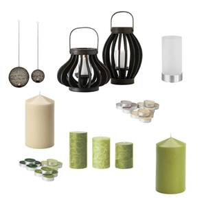

Red-Orange

ORBS + DECORATIVE OBJECTS
Orbs are a great way of adding some texture to an otherwise plain tray, dish or bowl. All you have to do is select a grouping of them, many are already packaged together in a collection for you so all you have to do is find an interesting vessel and place them. They could be housed on a bookshelf, your coffee table or sideboard. The possibilities are endless!


ARTWORK
Artwork is very personal and should reflect your personal tastes and style, but these pieces should also tie the room together or at least be a part of it. You want to make sure when selecting artwork for your space that the dimensions work and the type(s) of prints/canvas fit with the theme or look you're trying to convey. Take your time, one of the biggest mistakes people make is that they select art for the sake of selecting art. You should really love the piece before you make the commitment to purchase it, whether it's an original, something you picked up at a yard sale or something you've created on your own. This piece that you are inserting into your space should say something about you and sing in the room - but not like a banshee!

BOOKS
Books are a great way to add some personality to your bookcase or shelves, it's all in how you arrange them. Cramming as many books onto your bookcase doesn't look very appealing and feels a bit chaotic. Start by removing all the books from their current location and sort them by: 1. hardcover, 2. softcover (paperback), 3. oversized and 4. magazines/paper. Next is to sort them by colour; if you don't mind removing the covers from the hard-backed books you can easily sort the hardcovers this way. The spines of the softcovers should be grouped together by colour or colour combinations and the oversized books should be sorted the same. Next start removing books that look like they've seen some better days and all magazines/paper should be put into a magazine file or removed all together.
Instead of putting the books upright in rows on your shelves, why not try angling them or laying some down. Create a more relaxed look to the way you re-stack the books on your bookcase/shelf. Throw in some decorative objects as well to create a decorative look to the placement of your books. Just remember to keep the ones you use most often easily accessible and you'll be all set. Books can also be put on display on your coffee or side tables, stacked on the floor or on a nearby empty wooden chair. The choice is yours, so get creative with the arrangement of books in your space.
Here is a photo of the bookcase I have in the front/living combined dining rooms. The bookcase acts as a room divider for the spaces so both sides of the open-concept bookcase needed to look appealing from the front/living and dining spaces:

These tips that I have provided to you are a great start for making a good impact on the space that you decide to decorate. I used the family/living room as the example in this situation so as to help narrow down the amount of information about how to decorate spaces. You can easily apply these tips when decorating other spaces in your home as well. Based on the examples of objects and furniture items that I presented I have pulled together (as best I can, given the limited computer software that I have) the family/living room concept based on the neutral backdrop:

Quick Tip: White grounds the space, so be sure to inject white into your groupings or furniture.
Happy Shopping!
Courtesy of:
Pier 1
Structube
Anthropologie
IKEA
Art.com


No comments:
Post a Comment
Note: Only a member of this blog may post a comment.