The #1 Rule: The number one rule when decorating your space in one colour is to never use the same shade throughout. Colours (as I have mentioned in past) come in a plethora of shades, so the worst thing you could do is to pick a colour say, pale blue and use that same shade throughout your space without changing the depth of the colour. I know you're thinking to yourself again that I've lost it, but trust me, work with me on this one, and you'll see how easily you can decorate a space in no time using only one colour + white.
Why White?: The reason white is used as the anchor is due to its brilliance. White is a balancing colour which can easily be paired with any colour on the colour wheel and look fantastic. White creates cohesion and is calming to the eye it's appearance is thought of as clean and therefore will create balance between the colour you select and the room itself. Think of white as a non-colour, it's there, but it's not. White acts as a base and a neutral, so feel free to use it liberally or sparingly in your space, but be sure to use it!
What Colour Do I Choose?: That depends on you and the space, different colours can illicit different moods and have a certain feeling associated with them, such as:
BLUE - represents peace, tranquility, calm, stability, harmony, confidence, cleanliness and order.
BLACK - represents power, sexuality, sophistication, formality, elegance, wealth and depth.
GREEN - represents nature, environment, health, good-luck, renewal, youth and generosity.
ORANGE - represents warmth, enthusiasm, balance, vibrance, flamboyancy and demands attention.
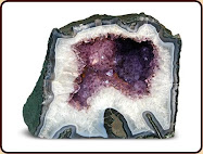
PURPLE - represents royalty, spirituality, nobility, ceremony, mystery, transformation and wisdom.
RED - represents strength, warmth, luck, love, desire, speed and vibrance.
WHITE - represents reverence, purity, simplicity, cleanliness, peace, humility and precision.
YELLOW - represents joy, happiness, optimism, idealism, imagination, hope and spirituality.
The colour you decide to choose for the space you have in mind should be reflective of the message you want to convey. Do you want the space to be restful or vibrant? Cool or warm? Keep these thoughts in mind when selecting the colour you would like to use as the colour you select does have this kind of impact.
How Can I Work the Colour Into The Room?: The easiest way to achieve balance with the colour you select (+ white) is to use the colour in varying shades. If you decide to go with the colour green for example use shades of green from apple green to olive. If you choose blue use shades from royal to aqua. Here are some examples of the varying colours you can use:


The trick is to inject colour into the room using the similar tones and levels of colour, you don't want to use all brights and darks because that will be too stark a contrast. Although, with that being said there is nothing wrong with injecting one or two smaller objects into your space that are outside the colour harmony. As you will see with the colour selections in green, blue, yellow and red above, the levels and tones of the colour can vary drastically from one spectrum to another.
If you decide to go with the colour pink for example, there is nothing wrong with using bubblegum pink to fuchsia. If you have a pillow in highlighter pink feel free to use it in the space. This is the variance I was talking about, as long as you don't use bubblegum pink and highlighter pink throughout the space you'll be just fine. It's all about balance.
TIP: When thinking about colour, take a trip to the local hardware store and into the paint section. Select a colour chip that strikes your eye. What you'll find is that the paint chip has provided you with the colour you like in varying tones and shades. The same principle applies when selecting objects for your space. Think in terms of paint chips.
So now that you have the basics in mind here are some examples of one colour + white rooms:


As you can see from the examples above the colour variations in the spaces differ, some are softer hues others are bold. The choice is yours and believe me, this is one of the easiest interior decor solutions for your space, just keep the tips I gave you above in mind when out searching for that next colour piece to add to your one colour + white room.
Happy Shopping!!


No comments:
Post a Comment
Note: Only a member of this blog may post a comment.